


Drops – Shoes Store Mobile App UI Kit is a comprehensive and modern mobile application design system built specifically for footwear retail, fashion eCommerce, and sneaker boutique experiences. Featuring over 100 meticulously crafted screens, this UI kit covers essential user journeys including onboarding flows, catalog exploration, advanced product filtering, detailed item views with interactive image galleries, secure checkout processes, order tracking, wishlists, and user profile management.
Crafted with advanced Figma auto layout, global style guides, and fully organized components, Drops empowers UI/UX designers, frontend developers, and digital agencies to launch high-performance eCommerce applications in record time. Its clean aesthetic and pixel-perfect design system make it the ideal asset for startups and established retail brands looking to elevate their mobile shopping experience and drive user conversions.
👟 Streamlined Footwear Shopping Experience
Designed specifically for footwear retailers and sneaker marketplaces, Drops features tailored layouts for brand categorization, size selection, flash sales, and immersive product showcases that generic eCommerce kits simply cannot match.
⚡ Accelerated Design-to-Development Workflow
Built natively in Figma with a comprehensive global style guide, auto layout, and meticulously named layers, this kit cuts production time in half while ensuring absolute consistency across every screen and component.
Fully responsive and scalable auto layout components
Comprehensive global style guide for effortless brand customization
Pixel-perfect spacing and strict adherence to modern design principles
Clean and logical layer naming convention for instant collaboration
Ready-to-use onboarding and authentication flows
Interactive product detail pages with variant selectors and reviews
Integrated checkout, cart management, and payment screens
Built-in typography scaling utilizing the Archivo/Geist font family
Splash Screen
Onboarding
Sign Up & Login
Home Feed
Explore & Search
Product Detail
Cart & Checkout
Wishlist
Message & Chat
User Profile
Have an idea to customize?
Let's develop your captivating idea into a realised digital product, let's discuss!

Similar products you may like


 View
View

 Live
Live

Piepaw - Pet Buying or Adoption App UI Kit
100+ Pages
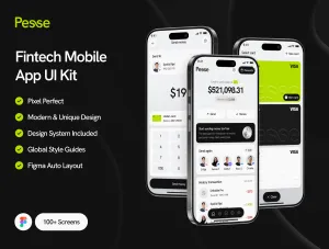
Pesse - Fintech UI Kit
100+ Pages

Iqraa - Qur'an Learning UI Kit
100+ Pages

Vocla - AI Voice Generator UI Kit
100+ Pages

Noona - Dating Apps UI Kit
100+ Pages

Lumin - Learning Management System UI Kit
100+ Pages

Pacino - Telemedicine Healthcare UI Kit
100+ Pages

Vesto - Stock UI Kit
100+ Pages

Merdamel - Job FInder UI Kit
80+ Pages

Lemontada - Booking Services UI Kit
100+ Pages


