


Finora – Finance Dashboard UI Kit is a comprehensive and modern design system engineered specifically for financial technology, digital banking, and investment platforms. Featuring over 100 meticulously crafted screens, this UI kit covers essential user flows including real-time dashboards, portfolio tracking, investment analytics, card management, AI assistant features, and secure authentication processes across both desktop and mobile viewports.
Built natively in Figma with advanced auto layout and a robust global style guide, Finora ensures absolute consistency, effortless scalability, and rapid customization. It is the ultimate asset for fintech startups, financial advisors, SaaS companies, and digital product agencies looking to accelerate their design and development workflows while maintaining a sleek, professional aesthetic.
🚀 Accelerate Your FinTech Development
Skip weeks of foundational design work with a fully realized, production-ready UI kit tailored precisely for modern banking and financial dashboards, allowing your team to focus immediately on core feature implementation and user experience.
💎 Enterprise-Grade Design Consistency
Leverage an advanced Figma design system built with auto layout, global styles, and modular components that guarantee pixel-perfect responsiveness and seamless brand adaptability across all desktop and mobile touchpoints.
Pixel-perfect spacing and alignment based on strict layout grids
Neatly organized layers and components with intuitive naming conventions
Reusable dynamic components for rapid prototyping and scaling
Includes Geist font family for clean and modern typography
Global style guide covering colors, typography, and form elements
Fully customizable elements designed for 100% editing flexibility
Dashboard
Investment Analytics
My Cards
Transaction History
Savings Portfolio
AI Assistant
Onboarding and Register
Email Verification
News and Updates
Have an idea to customize?
Let's develop your captivating idea into a realised digital product, let's discuss!

Similar products you may like


 View
View
Synrise - Social Media AI Dashboard UI Kit
110+ Pages


Nexora - CRM AI Dashboard UI Kit
100+ Pages


Shapery - AI 3D Generator UI Kit
100+ Pages

Inventra - Warehouse Management UI Kit
100+ Pages
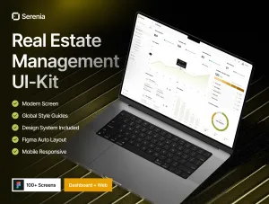
Serenia - Real Estate Management UI Kit
100+ Pages
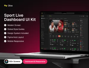
Olive - Sports Live Score UI Kit
100+ Pages

Vergelle - Cosmetics E-Commerce Web UI Kit
100+ Pages

Vocla - AI Voice Generator UI Kit
100+ Pages

Ngajuh - Furniture UI Kit
100+ Pages

Camero - CRM SaaS UI Kit
100+ Pages


