If there is one feature in Figma that separates beginner designers from seasoned professionals, it is Auto Layout.
Building static, rigid frames in Figma leads to hours of wasted effort whenever copy changes or responsive screen sizes are required. Auto Layout transforms your design files into dynamic, code-ready components that behave exactly like real web elements.
In this guide, we break down everything you need to master Figma Auto Layout—from basic button structures to complex, responsive card systems.
1. The Fundamentals: What Is Auto Layout?
Auto Layout is Figma’s visual counterpart to CSS Flexbox. It allows frames and components to grow, shrink, and reflow dynamically based on their content and alignment rules.
- Static Frame: Text changes ➔ Layout breaks (Requires manual resizing every time)
- Auto Layout Frame: Text changes ➔ Layout adapts automatically (Zero effort needed)
Essential Controls in Figma:
- Direction: Set layout flow to Vertical (column) or Horizontal (row).
- Padding: Control top, right, bottom, and left internal margins around elements.
- Gap: Specify exact pixel distance between child items.
- Alignment: Anchor items to top-left, center, space-between, etc.
2. Resizing Modes: Hug, Fill, and Fixed Explained
Mastering resizing behaviors is the key to building scalable components for web and mobile interfaces:
Hug Contents
- Behavior: The parent container resizes dynamically to fit its internal content.
- Ideal Use Case: Buttons, Badges, Tooltips, and Tags.
Fill Container
- Behavior: The child element stretches to occupy all available space within its parent frame.
- Ideal Use Case: Body text inside cards, Full-width inputs, Banner headings.
Fixed Width / Height
- Behavior: The container maintains exact pixel dimensions regardless of the content inside.
- Ideal Use Case: Fixed sidebars, Specific image containers, Avatar frames.
3. Step-by-Step: Building a Responsive Web Card
Follow these steps to construct a production-ready UI card component:
Step 1: Build the Badge Component
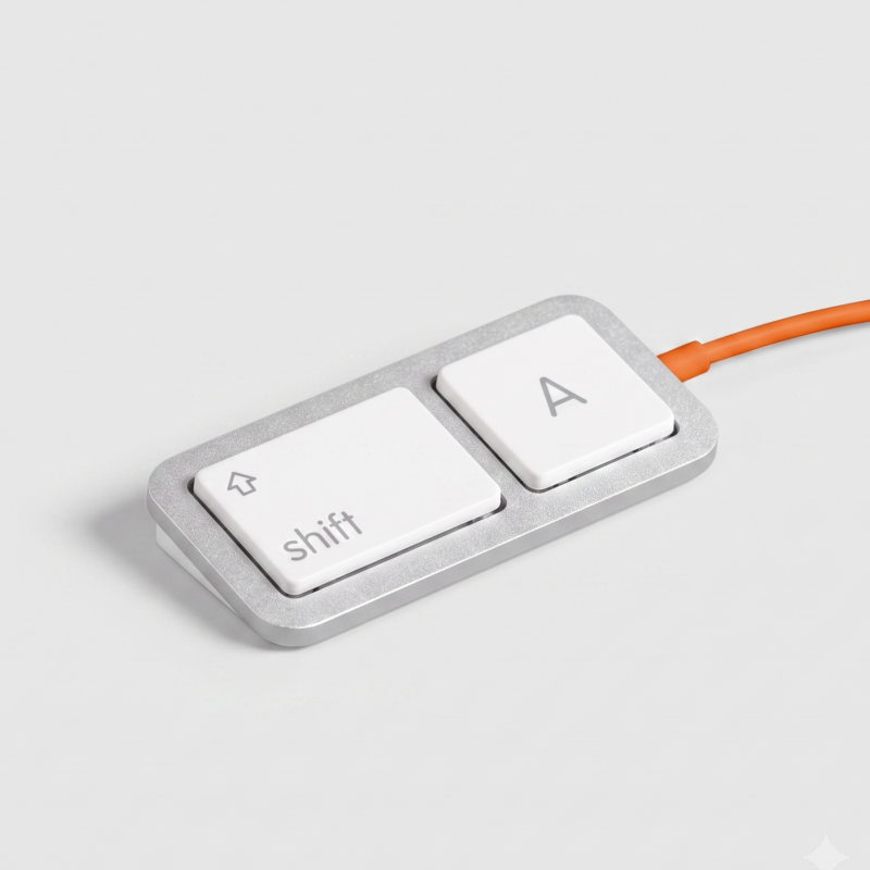
Type your label text (e.g., "Featured"). Press Shift + A to enable Auto Layout. Set padding to 6px 12px and set resizing to Hug Contents.
Step 2: Group Text Layers
Select your Card Heading and Paragraph text. Press Shift + A to create a vertical Auto Layout container. Set the direction to Vertical, Gap to 8px, and switch both text layers to Fill Container.
Step 3: Assemble the Final Component
Combine your Image, Text Container, and Button. Apply Auto Layout (Shift + A).
- Set Direction to Vertical.
- Set Padding to 24px and Gap to 16px.
- Set internal elements to Fill Container so the card adapts seamlessly across mobile, tablet, and desktop viewports.
4. Advanced Figma Auto Layout Techniques
Absolute Positioning
Need to place a notification badge or close icon on top of a card without breaking the Auto Layout flow? Click the Absolute Position icon in the right sidebar to position elements freely within an Auto Layout frame.
Negative Spacing & Overlaps
Enter negative values in the Gap field (e.g., -12px) to build overlapping avatar stacks, stacked image galleries, or layered card decks effortlessly.
Accelerate Your Design Workflow with Caraka
Mastering Figma Auto Layout not only speeds up your creative process—it ensures seamless developer handoffs by mirroring clean CSS layout logic.
Want to skip building components from scratch? Check out Caraka’s Premium UI Kits & Templates—pre-configured with advanced Auto Layout, interactive variants, and scalable design tokens to help you launch digital products faster.