The landscape of digital product design is shifting faster than ever. As artificial intelligence moves from feature-add-on to foundational architecture, and spatial computing becomes mainstream, the way users interact with software has fundamentally transformed.
To keep your product competitive, static layouts and generic design systems are no longer enough. At caraka.io, we’ve analyzed the most impactful visual and functional design patterns shaping digital experiences today.
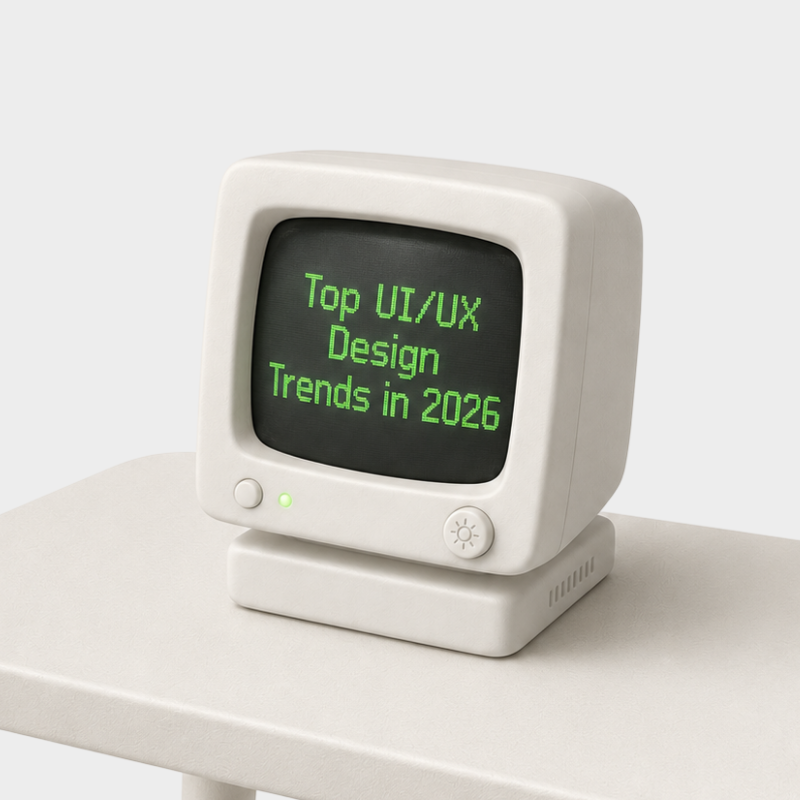
Here are the top UI/UX trends defining product design right now.
1. AI-Native & Intent-Driven UI
Interfaces are transitioning from reactive (waiting for clicks) to intent-driven (anticipating needs). Instead of forcing users to navigate complex nested menus, modern apps leverage generative UI that adapts on the fly.
- Dynamic Layout Adaptation: Interfaces automatically reconfigure components based on user context, historical behavior, and current task goals.
- Prompt-to-Action Controls: Text and voice inputs are seamlessly integrated directly into canvas spaces, reducing reliance on traditional toolbars.
- Context-Aware Assistance: Micro-prompts appear precisely when friction is detected, offering inline suggestions without disrupting flow.
2. Spatial UI & Modern Depth Systems
With spatial headsets and 3D web standards now mature, flat visual design has evolved into multi-layered depth experiences. Even on traditional screens, designers are adopting subtle spatial cues to establish clearer visual hierarchy.
- Layered Materiality: Glassmorphism has evolved into tactile, semi-translucent surfaces that reflect real-time lighting and background context.
- Spatial Lighting & Shadows: Soft, dynamic elevation replaces heavy drop shadows to communicate interactive depth naturally.
- Cross-Device Continuity: UI components are built to scale fluidly from flat desktop screens to 3D spatial environments without losing structural integrity.
3. High-Fidelity Micro-Interactions & Organic Motion
Static transitions feel dated. Modern UI relies heavily on physics-based animations that offer real-time feedback, making digital products feel responsive, living, and tactile.
- Haptic & Spatial Feedback: Subtle visual bounces and morphing states give users immediate confidence during complex tasks.
- Progressive Loading States: Skeleton screens are being replaced by dynamic visual state transitions that explain what the system is doing behind the scenes.
- Variable Typography in Motion: Interactive fonts respond dynamically to scroll depth, cursor proximity, or user interaction state.
4. Hyper-Personalization & Accessibility First
Designing for the "average user" is an outdated approach. Modern design systems are engineered to accommodate individual accessibility needs and aesthetic preferences automatically.
- Adaptive Color & Contrast: Systems dynamically adjust palette contrast based on ambient lighting conditions and user visual requirements.
- Flexible Spatial Layouts: Text scaling, touch targets, and element density adjust automatically without breaking fluid grid constraints.
- Neuroinclusive UX: Reduced-motion modes, simplified focus states, and customizable distraction-free views are becoming standard default features rather than hidden settings.
Choosing the Right Approach for Your Design System
Building a modern design system requires balancing innovation with usability. Here is how leading teams prioritize these trends:
Core Focus: Usability & Functionality
- Primary Strengths: Intent-driven UI and adaptive accessibility layouts.
- Best Used For: Enterprise SaaS platforms, complex data dashboards, and productivity tools where speed and clarity are paramount.
Core Focus: Brand Engagement & Delight
- Primary Strengths: High-fidelity micro-interactions, physics-based motion, and modern spatial depth.
- Best Used For: Consumer mobile apps, creative tools, and landing experiences designed to drive high conversion and user retention.
Best Practices: How to Implement Modern Trends Safely
The Golden Rule: Trends should serve usability, not distract from it. A visually stunning interface that confuses users is still a failed design.
To effectively upgrade your design system, keep these core principles in mind:
- Start with Tokenized Foundations: Ensure your color palettes, elevation levels, and typography rules are fully tokenized in Figma before adding complex motion or spatial depth.
- Test Motion Performance Early: Heavy animations can slow down web applications. Optimize vector assets and use CSS/canvas hardware acceleration.
- Validate Accessibility Continuously: Always test dynamic color contrast and adaptive layouts against WCAG standards across multiple viewports.
Building the Future of Design with Caraka.io
Mastering modern UI/UX requires a deep understanding of design aesthetics, front-end architecture, and emerging AI capabilities. Whether you are scaling a design system, refactoring a web platform, or creating next-generation digital products, staying aligned with these trends ensures your user experience remains modern, intuitive, and engaging.
At caraka.io, we build and share insights on the intersection of design, AI, and modern web technology.